Why spacing drifts as a site grows
You can usually tell when spacing has drifted because the UI feels “almost” aligned: cards don’t breathe the same, form fields land at slightly different heights, and similar pages look like they were built by different teams. It rarely starts as negligence. It starts as speed. Someone nudges a margin from 16px to 18px to fix a single awkward breakpoint, another person copies a component but tweaks padding to match a new icon size, and a third adds a one-off gap because the grid “felt tight.”
Over months, those tiny exceptions multiply into dozens of near-duplicate values that are hard to reason about. Designers can’t predict what devs will pick, devs can’t tell which numbers are intentional, and refactors get expensive because changing one component risks making its neighbors look wrong.
What a reusable spacing scale actually is
You’ve probably seen a team try to “standardize spacing” by writing down a few popular numbers, then still reach for 18px when a layout feels off. A reusable spacing scale is stricter than a list of favorites and looser than a full design system. It’s a small set of approved spacing steps that cover most needs—inside components (padding), between elements (gaps), and between sections (layout rhythm)—so you’re choosing from a menu instead of inventing new values.
In practice, it means agreeing that similar relationships use the same step: the gap between a label and input is always one size, card padding is another, and page sections follow a predictable progression. The scale only works if it’s easy to apply and hard to bypass, otherwise one-off “fixes” sneak back in.
Picking the steps: 4px, 8px, or something else

Most teams already have an unspoken base unit. You see it in how often 8, 16, and 24 show up, and in how frequently “just add 4px” gets used to calm down a tight layout. A 4px step is a practical default because it’s fine-grained enough to handle small UI relationships (icon-to-text, label-to-input, chip padding) without inventing odd numbers. An 8px step is simpler to remember and tends to keep layouts bold and consistent, but it can feel chunky in dense UIs unless you allow half-steps.
A good rule is: pick the smallest step you can apply everywhere without constantly wishing it were smaller. If your product has compact tables, filters, and forms, 4px usually wins. If it’s mostly marketing pages and spacious dashboards, 8px can work. The constraint is real: fewer steps means faster decisions, but it can push you toward exceptions. If you see “10px” and “18px” showing up to compensate, your step size is probably too coarse for your day-to-day components.
Define tokens that designers and devs share
You’ve seen the failure mode: the designer says “use 16,” the dev uses “1rem,” another dev uses “var(--space-md),” and a month later nobody knows if those are meant to match. Shared spacing tokens solve that by giving the scale names and a single source of truth. Keep the naming boring and ordinal: --space-0, --space-1, --space-2… mapped to your actual steps (0, 4, 8, 12, 16, 24, 32, etc.). Designers can label specs with the same token names, and developers can implement them without translating every handoff.
Two practical constraints matter. First, don’t create tokens for every scenario (“card-padding,” “modal-gap”) yet; that turns into a second system to maintain. Start with raw spacing tokens, then add a small layer of semantic aliases only where it prevents churn (for example, --space-card-padding referencing --space-4). Second, write down when it’s acceptable to go off-scale, and require a reason; otherwise the token list grows while consistency still drifts.
Implement it in CSS without fighting yourself
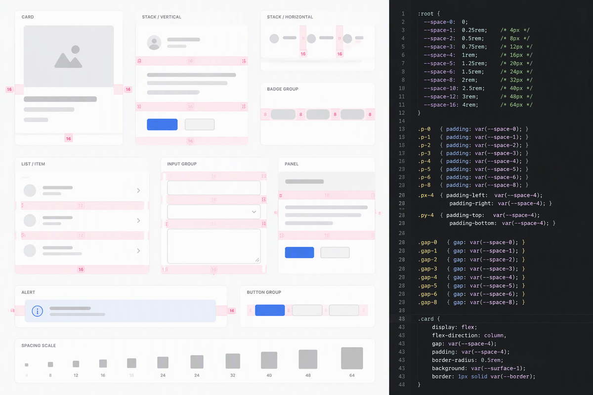
You feel the pain when the scale exists “in theory,” but the codebase still encourages one-off numbers. Start by defining the tokens once, as CSS custom properties on :root (or a theme wrapper), and only export the steps you actually use. Then wire them into the places you already touch every day: component padding, stack gaps, and layout spacing. If people have to remember whether the “right” value is 12 or 16, they’ll reach for pixels.
Make the default path ergonomic. Utility classes like .p-3, .mt-4, .gap-2 mapped to tokens are blunt, but fast, and they keep refactors consistent. For component CSS, prefer patterns like padding: var(--space-4) and gap: var(--space-2), and avoid mixing raw values in the same file. A real constraint: you’ll still need escape hatches for third-party widgets or legacy layouts, but force those into a single “exceptions” layer so the mess doesn’t spread.
Apply the scale to real components and layouts
You notice whether a scale works the moment you try to build boring UI. Take a common “card” pattern: header (title + actions), body text, and a footer row of buttons. Pick one token for card padding (say --space-4), one for internal vertical rhythm (--space-2 between lines, --space-3 between groups), and commit. If the header and footer both use the same inset and the same gaps, the component reads as one object across the site—even when content lengths change.
Then stress it with layouts. For a page, define a default “stack” gap between sections (--space-6, for example), and a smaller gap for related items within a section (--space-3). Apply the same logic to forms: label-to-input is one step, input-to-help text is another, and field-to-field spacing is consistent even when a validation message appears. The practical cost shows up here: you’ll occasionally redesign a component instead of nudging spacing, because the scale exposes when the real problem is hierarchy, not pixels.
Handle exceptions and keep consistency over time
You’ll still hit cases where the scale doesn’t land: a third-party widget with hardcoded padding, a legacy table row height, or a breakpoint where two tokens feel too tight or too loose. Treat those as exceptions you can find later. Put off-scale values behind a named alias (for example, --space-widget-fix) or in a single overrides file, and add a short comment with the reason and owner. The ongoing cost is review discipline: lint for raw pixel spacing, and make “which token?” a normal part of PR feedback so drift gets caught early.