What “design freedom” really means for beginners
“Design freedom” sounds like infinite creativity, but for a beginner it usually means something simpler: can you change layout, spacing, and type without fighting the template? The most useful freedom is the ability to move sections around, adjust padding and margins, set consistent fonts and colors, and control how a page stacks on mobile versus desktop. Too little freedom leaves every site looking like a cousin of the same theme. Too much freedom can slow you down, because you’re making dozens of small decisions the template would normally decide for you.
A practical way to judge freedom is how often you hit a wall. If you try to place two elements side-by-side, change column widths, or tighten whitespace and the builder forces a fixed pattern, that’s a boundary. If you can do those changes but it takes multiple hidden panels, that’s still a cost: more time, more chances to make the page feel inconsistent.
Quick checklist: the no-code controls to look for
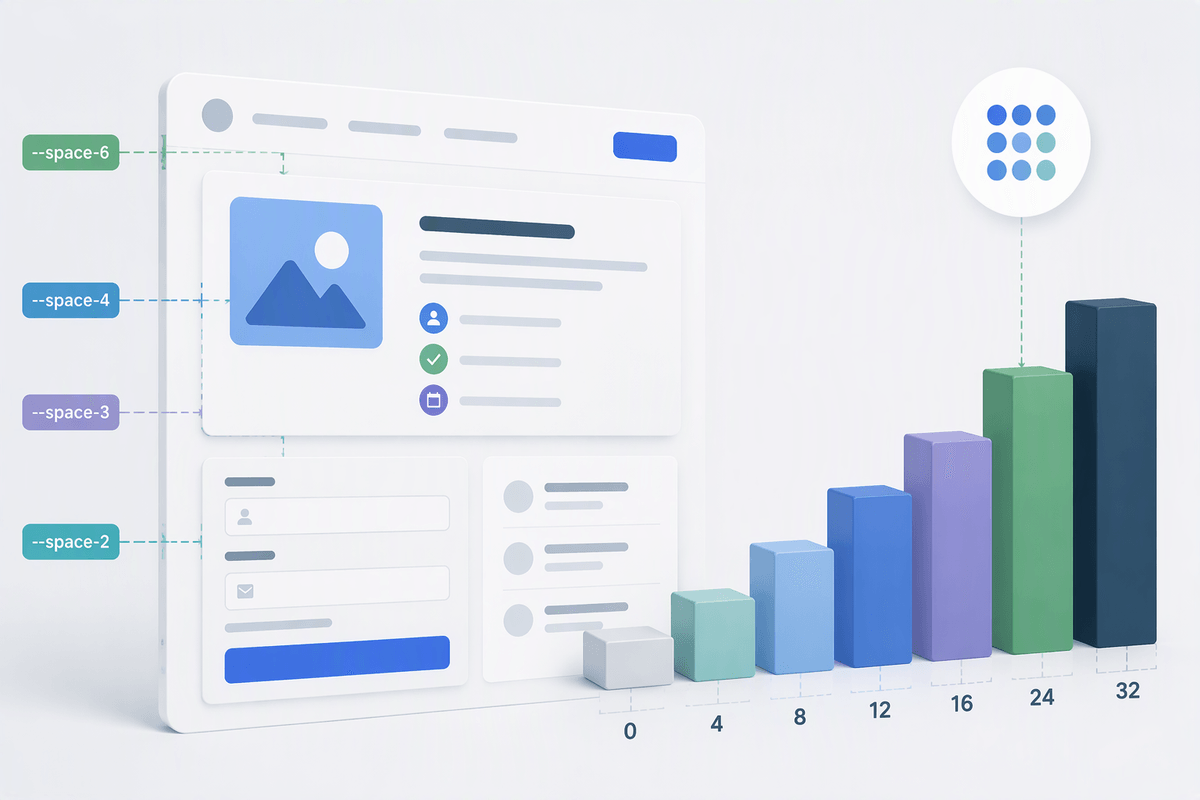
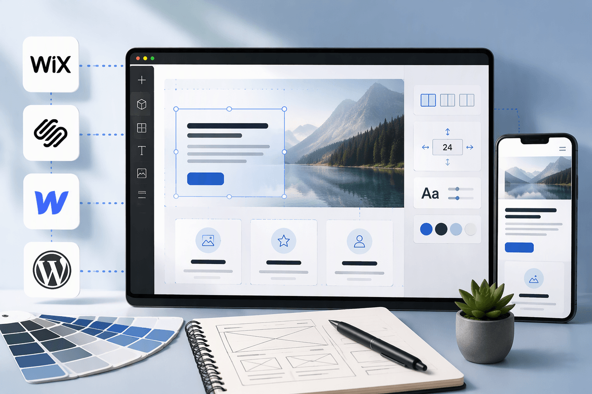
You’ll feel a builder’s “freedom” within minutes if you test a few specific controls. Start with layout: can you add columns, change their widths, and reorder sections without breaking alignment? Check spacing next: look for padding and margin sliders (ideally with numeric values) plus a way to save consistent section spacing so every page doesn’t drift. For typography, you want global styles for headings and body text, not one-off font edits that turn into a mess later.
Responsive control is the make-or-break detail. See whether you can adjust stacking order, hide elements on mobile, and tweak spacing per device without duplicating entire sections. Also look for reusable components (saved sections, symbols, or blocks) and basic design guardrails like grids and snap-to alignment. The trade-off: more controls usually means more panels to learn, and it’s easier to create a layout that looks good on desktop but feels cramped on phones.
Wix: most freedom fast, with a few caveats
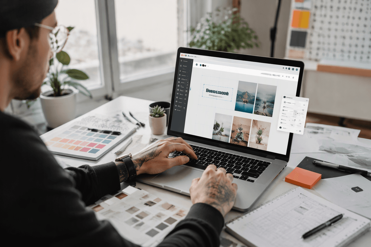
If you’ve ever wanted to drag a headline three inches to the left just because it looks better there, Wix tends to feel immediately “free.” Its editor is built around direct manipulation: you can move elements around, stack them, resize them, and adjust spacing without constantly negotiating with a template’s fixed rules. For a first site, that speed matters. You can get from blank page to “this looks like my brand” in an afternoon, especially if you lean on prebuilt sections and then tweak fonts, colors, and padding to match.
The caveat is that freedom can turn into manual cleanup. When you place items more freely, you also take on alignment and consistency work that stricter systems handle for you. It’s easy to end up with slightly mismatched spacing across pages or a layout that looks fine on desktop but needs extra mobile adjustments. Expect some time spent checking each breakpoint, and be cautious about mixing lots of one-off font sizes instead of setting global styles early.
Squarespace: polished templates, tighter layout boundaries
Squarespace usually wins on “looks good quickly” because its templates are tightly art-directed. You’re often choosing between well-designed section patterns rather than inventing layout from scratch, which keeps typography, spacing, and alignment feeling consistent across the site with less effort. For many first-time creators, that’s a real form of freedom: you can focus on content and brand choices (colors, fonts, imagery) without constantly fixing visual mistakes.
The trade-off is layout flexibility. If you want a very specific arrangement—an overlapping element, an unusual grid, or a precise column proportion—you may find yourself working around the system instead of directly editing it. The editor can feel “block-first,” where you swap sections, adjust spacing within allowed ranges, and accept certain rules about how content stacks on mobile. In a free trial, try rebuilding one “custom” section you have in mind; if it takes three compromises, you’ve found the boundary.
Webflow: near-total control, but a steeper learning curve
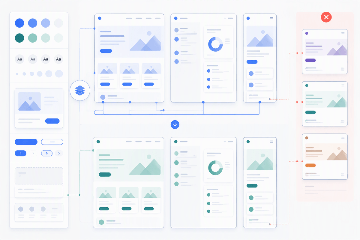
You’ll recognize Webflow’s “near-total control” the moment you try to nudge spacing, set a grid, or create a section that doesn’t match any template pattern. It treats your page more like a structured layout system than a simple drag-and-drop canvas: containers, columns, flex, and grid let you decide exactly how elements align and how they reflow at different screen sizes. If you care about precise spacing, consistent type scales, and a homepage hero that behaves perfectly on mobile, Webflow can deliver that without writing code.
The cost is that you’re still learning the logic of the web, just through a visual interface. Class-based styling, positioning, and responsive breakpoints can feel abstract at first, and it’s easy to “fix” one view and accidentally create extra work on another. Expect a slower first build, plus time spent organizing styles so the site doesn’t become a pile of one-off tweaks. In a trial, test one custom layout and then duplicate it on a second page; if reuse feels clean, Webflow’s control is working for you rather than against you.
WordPress page builders: flexible, but more moving parts
You’ll often hear WordPress described as “the most flexible,” and with page builders like Elementor, Divi, or Beaver Builder, that can be true in practice. You get deep control over sections, columns, spacing, and typography, plus a huge ecosystem of themes and add-ons. If you want a site that can start simple and later grow into more custom layouts, landing pages, or even membership and booking features, WordPress has room to expand without switching platforms.
The trade-off is moving parts. Your experience depends on the theme, the builder, and the plugins you install, and each one can add settings, updates, and potential conflicts. Performance can slip if you stack too many add-ons, and “simple edits” sometimes mean hunting through multiple menus to find where a style is coming from. In a trial build, pay attention to two things: how quickly you can make a consistent design system (global fonts, buttons, spacing), and how the page looks on mobile without manual fixes.
Choosing the right builder for your first site
You’ll choose faster if you start from one real page you need (home, services, contact) and one “annoying” section you care about (a two-column feature list, a testimonial grid, a pricing table). Build that in free trials and time how long it takes to get it looking right on desktop and mobile. If you want maximum visual freedom quickly and can tolerate some alignment cleanup, Wix is usually the smoothest start. If you value consistent polish and fewer chances to make a messy layout, Squarespace is the safer pick. If you’re willing to learn structure for long-term control, Webflow can be worth the ramp. If you expect lots of future features, WordPress can fit, but budget time for setup, updates, and troubleshooting.